
SLI home
User login

A BLOG FOR E-COMMERCE LEADERS

  • Blog
  • Resources
  • Webinars
  • Customer Experience Scorecard

SLI Blog

Posts with Mobile Shopping Tag

Retail Executive Brief: Customer Experience Trends for 2018

Posted by Bob AngusNovember 30, 2017Analytics, Artificial Intelligence, Customer Experience, E-commerce Research, eCommerce, Merchandising, Mobile, Mobile/Tablets, Personalization, Reporting and Analytics, User Experience

Customer Experience - Convert Buyers with a Great Customer Experience

The pressure is on for retail businesses to deliver on big sales growth expectations. That’s in the face of slow consumer spending growth combined with the tectonic shift in traditional retail channels.

You need to turn more shoppers into buyers. You can’t afford for your investment to bring more shoppers in the door or onto your e-commerce store that leave with an empty cart.

That’s why optimizing your customer experience is more important than ever.

This retail executive brief helps you better understand:

  • How customer experience strategies are evolving
  • What customer experience metrics to track and analyze
  • How to improve your customer experience using top trends in 2018

Let’s first dig into how customer experience is changing.

What is Customer Experience Today?

In the past, customer experience strategies focused on the discrete interactions shoppers had in the sales process. These touchpoints took on even greater importance with online retail channels simply because it was easier to track and optimize each webpage leading up to a sale.

However, this touchpoint-focused approach to improving customer experience can easily miss one critical element… the customer journey.

The journey is the customer experience.

The overall journey can still disappoint customers, even if your online store design, in-store layout and staffing are executed well on individual touchpoints.

Understand the customer journey in your shoppers’ terms. Customer journeys include many things that happen before, during, and after the actual purchase experience.

The journeys can be quite long, though the purchase decision can be extremely fast. Consider the multiple channels, devices, and, yes, direct interactions that may occur over days or even weeks.

Put yourself in their shoes. You buy products for yourself all the time. Think about your entire experience and why you made a purchase or didn’t.

Ask questions like:

  • Where and when did you first learn about a store?
  • What was your first impression of the brand?
  • What triggered you going in the store or to the website?
  • How easy was it to find what you wanted?
  • How did you feel about the product price and value? Product quality? Selection for you?
  • How did you feel about the shopping environment in-store or online?
  • What sales help, customer service or employee interactions did you have?
  • How did the purchase transaction go? Was it fast and easy?
  • How did you get your product? Was shipping fast? Did you need to exchange or return?

Always be asking how you can improve that journey.

Next you need to figure out if you’re on the right path to improvement.

Customer Experience Measurements for Success

How do you know you are improving your customer experience? You’ll want to look at the numbers.

It’s very tempting to dive right into the weeds. Retailers now have so many powerful analytics tools. And data collection is getting easier.

However, direct contribution to macro financial metrics and sales trends can be difficult. Remember, your customer experience is a holistic journey. So your best customer experience metrics are more macro. They are not necessarily analyzing and optimizing discrete touchpoints.

Start by measuring key customer experience outcomes, customer feedback, and employee feedback.

Financial Metrics

The most common outcome metrics are financial. Let’s assume you are already tracking total revenue, profit, and transaction volume. Great financial indicators of your customer experience is Revenue per Customer and Average Transaction Value.

Make sure to also track Revenue per Visit (RPV) for your online channel or if you are a pure e-commerce business. This metric estimates the incremental value of each visitor to your online store. Simply divide your total online revenue by the total number of unique visitors to your website.

Customer Satisfaction

You also need to measure your Net Promoter Score (NPS) to capture how customers feel about you. NPS is a fantastic customer satisfaction metric to track over time. Customer experience and customer satisfaction are closely correlated.

But the most actionable customer experience metric in your NPS comes from the answer to the follow-up question – “Why did you give that rating?”

Categorizing the results of this open-ended “Why” question helps you measure the impact on different factors in the customer journey in your customers’ terms. For example, you may group results by broad areas like customer service, products, or pricing. Or you can go more granular into the touchpoints like checkout experience, shipping, or return policies.

Learn more by further breaking down your NPS by customer segments. You can segment by geography, gender or age demographics, order revenue, or purchase frequency or recency.

Employee Satisfaction

Lastly, you should also measure your Employee NPS. Employee satisfaction is also highly correlated with customer experience. Happier employees lead to better customer experiences.

After all, your employees are most responsible for delivering a great customer experience. All your employees contribute. Even someone behind the scenes in HR, the warehouse, or web development have an impact that trickles into the experience.

Here again, look closely at the “why” to measure and track the drivers that influence your employees’ feelings. Those feelings result in behaviors and actions that directly and indirectly impact your customer experience. Listen to what they say and recommend.

Track these financial and satisfaction metrics consistently. That’s how you will know your customer experience is on the right path.They are your “North Star” numbers.

Once you’ve established those customer experience measurements, you can then go deeper into specific success metrics for operational improvement initiatives. Use Google Analytics and e-commerce platform results for your online channel.

Now let’s look at the latest trends you can leverage to boost your customer experience metrics and sales.

3 Technology Trends that Help You Improve Your Customer Experience in 2018

Retailers continue to leverage technology to improve customer experiences. Much of the change comes from consumer technology use as a pulling factor. For the first time ever, more people say they plan to shop online (59%) than in big box stores during the 2017 holiday season, according to the NRF.

Here are three technology trends that help brands connect better with customers and improve their overall customer experience.

1. Rapid Growth of Mobile Shopping
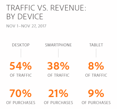
Mobile Traffic and Sales Statistics - Black Friday 2017 Cyber Monday 2017

The continued rapid growth of smartphone use is undeniably impacting retail sales. Similar to how e-commerce is the growth engine of overall retail, mobile sales are powering e-commerce.

The rising tide is driving much of that growth. Mobile traffic from smartphones and tablets peaked on Black Friday and Small Business Saturday (56% of traffic). Then leveled out to 46% of traffic, almost equivalent to desktop traffic (54%), through Cyber Monday 2017, according to Adobe Digital Insights.

However, the mobile shopping experience is a challenge for retailers. Smartphones and tablets earned a lower percentage of overall sales (30% versus 70% for desktop) and lower conversion rates through Cyber Monday.

Retailers can close more sales with mobile shoppers by continuing to improve their mobile customer experience. Shoppers now find mobile as an easy way to check emails (hopefully your emails), find store locations and hours, get product information, snap and share photos, and compare prices.

Optimizing mobile product discovery and mobile payments are the biggest opportunities for retailers to improve the mobile customer experience.

2. Personalized Merchandising with Artificial Intelligence

Customers want a personalized shopping experience. Sales people help shoppers in the store. Now application of artificial intelligence are helping online stores create a similar personal customer experience.

Online stores have massive amounts of behavioral and transactional data now. The challenge is to harness that data to power real-time merchandising decisions.

That’s where artificial intelligence excels.

Fifty-four percent of e-commerce sites have already implemented or plan to add AI in the future, according research from the Q3 2017 E-commerce Performance Indicators and Confidence Report. And 20% expect to add AI within the next 12 months.

The top application is personalized product recommendations. Eighteen percent of online retailers report they are already using artificial intelligence in their product recommendations strategies. But that number will swell dramatically in 2018 with 38% planning to implement within the next 12 months.
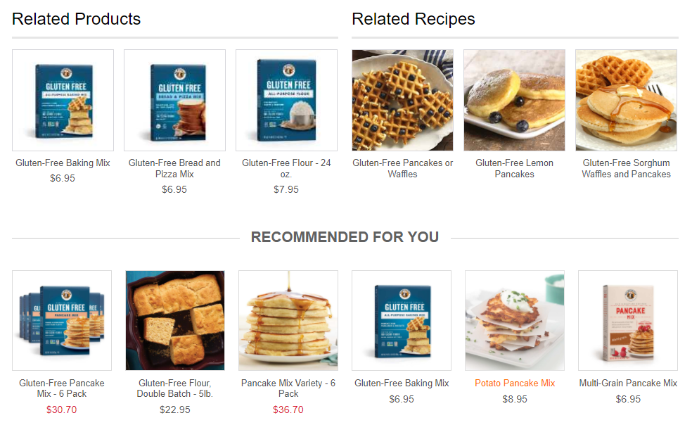
Personalized Product Recommendations Engine - King Arthur Flour

Artificial intelligence can parse user activity, preferences, and sales trends. The result is smart and timely product recommendations that are personal. For example, this type of contextual personalization can be tuned to gender, clothing size, brand preference, or shopper’s location.

Even better for online retailers, this personalization can be experienced by first-time visitors just as well as returning shoppers. So the shopper does not have to take any additional actions to receive the customer experience benefits.

3. Always on Customer Service with Chatbots

Chatbots were introduced as a new technology on the horizon for retailers in our 2017 e-commerce trend webinar. In 2018, chatbots are a must-have element of your online customer experience.

Ecommerce Chatbots - Retail live chat is always on

Think of chatbots like your online version of a sales associate or employee. Except they are always on 24/7/365.

A chatbot is an enhancement from the online chat communication channel. The old chat program still required a human sitting there typing in replies. Those employees had regular shifts. So sometimes customers weren’t getting their questions answered.

Now a chatbot is an always-on program that simulates the conversations your customers have with you. It answers questions, handles specific requests, helps shoppers choose the right product, and executes customer service procedures.

Your customer experience impact is shoppers have better and faster access to what they want when they want it. That’s a huge win. And you win more sales.

Customer adoption, and the resulting better experience and sales, is the biggest reason why chatbots are growing in e-commerce. Additionally two technology drivers are accelerating the deployment of chatbots – smartphones (again) and artificial intelligence (again).

Smartphone use is leading to speaking with a chatbot. Talking is easier than typing. Just say what you need and the chatbot tells you back. Siri, Alexa, and Google Assistant are all voice-enabled chatbots that are quickly growing is use.

Artificial intelligence is helping chatbots be more effective. The chatbot can repeat existing information easily and can be taught to mimic decision-making patterns. But artificial intelligence makes a difference by helping chatbots to actually learn. So your customer experience is continuously improving.

Design Your Customer Experience to Win More Sales

Planning and executing your customer experience strategies is a process of continuous improvement. Deeply understanding your customer’s journey sets you on the right path.

Take advantage of the key trends and technologies. Then test your innovations, measure, and optimize for the satisfaction of your customers and for the results that matter to you.

Ultimately, you can achieve what creative executive Loie Maxwell calls “designed serendipity”. Orchestrate the experiences that produce a customer journey that gives them a winning feeling. Your customers will love it. And you will win more sales.

Is Your Customer Experience Leaking Sales?

Most businesses are leaking online sales in at least 7 critical elements of their customer experience.

The Customer Experience Scorecard grades your e-commerce site using a 42-point checklist proven to increase sales, including:

  • Quickly finding products shoppers are most likely to buy
  • Personalized product recommendations
  • Mobile path to purchase

Want to find your leaks? Find out your quick-win opportunities to take your conversion rates to the next level.


Master 2015 Holiday Trends to Clinch 2016 Holiday Sales

Posted by Chris Brubaker, Chief Marketing OfficerSeptember 7, 2016eCommerce, Mobile/Tablets, SEO, Site Search, Site Search Tips, Uncategorized

tipsEvery year it seems like just as we start settling into the summer haze, holiday planning kicks into high gear! Since 31.5% of the $343 billion transacted online occurred in the fourth quarter last year (U.S Commerce Dept), smart retailers can’t afford to nap (for too long) in that beach chair. If those numbers don’t get you on your feet, take this in. During the 2015 holiday season:

  • Non-store sales (mostly online) grew 9%, compared to 1.9% in-store sales growth (NRF)
  • Sales from desktop surpassed $1 billion on 16 days during Holiday 2015 (Comscore)
  • The average transaction size via desktop was higher than mobile and in-store. More than half of consumers increased the amount of shopping they did online this year (NRF)

It’s no time to panic though. You’re right on time. Instead, let’s reflect on key trends from 2015 to ease back into and clinch holiday sales this year:

#1. Consumers actively shop online on Thanksgiving Day (and earlier that week).

This is no longer in question (or taboo). In 2015, online sales increased 21% over Thanksgiving 2014 (IBM). For perspective, this is 58% over the 2012 holiday. On Thanksgiving 2015, AOV was $123 (surprisingly on par with Cyber Monday) and estimated web sales were $1.73 billion (Adobe). Other top revenue days to keep in mind this season include (Custora):

  • Cyber Monday: 6.3% of holiday revenue, $3.07 billion in web sales
  • Black Friday:2% of holiday revenue, $2.74 billion in web sales
  • Sun, Nov 29 (3%), Sat, Nov 28 (2.8%), Tue, Nov 24 (2.7%) and Wed, Nov 25 (2.2%)

PRO TIP: Arm your site with strong promotions early in the holiday season. Last year, Amazon offered Black Friday deals an entire week early. Macys.com Black Friday deals started the day before Thanksgiving, and Walmart.com followed suit offering deals early on Thanksgiving Day. U.S. consumers made 47% of their online purchases by the end of Cyber Monday (Comscore).

#2. Consumers shop heavily on their mobile devices.

While we all know this at this point, the numbers really drive the message home. During the 2015 holiday season, U.S. mobile sales increased 59% to $12.65 billion, which is 18% of U.S. holiday e-commerce sales; and mobile traffic exceeded desktop traffic every day during the season (Comscore). What’s more, based on research from 8,000 brands and 35,000 e-commerce shops, IBM found 31% of Nov/Dec web sales occurred on mobile.

PRO TIP: If they can’t find it, they can’t buy it. Given the space and speed challenges of smartphones, a prominent search box can be the best gateway to quickly finding and buying products on mobile sites and apps. The most important site search feature is relevance. If you provide relevant and fast search results, visitors are more likely to find what they’re looking for and make a purchase (e.g. push the most popular results for a search term to the top of the list).

#3. Consumers are coming to and buying from your site via Search.

Search brought in 29% of retailers’ online sales during the 2015 holiday season, second only to Affiliates (Adobe). Other acquisition methods include Direct (22%), Email (15%) Display (2.5%) and Social (1.4%). What’s more, 56% of searches were conducted on a smartphone or tablet during the 2015 holidays (NRF). Fortunately, if your site meets the following five criteria, you have an excellent starting point to succeed with your search engine rankings:

  1. Your products and content are relevant to the search phrases shoppers actually use
  2. Your site is mobile-friendly
  3. Many highly credible sites link to yours
  4. Your page load times are sufficient
  5. You score well in engagement signals such as bounce rate, time on site, and pages visited per session

PRO TIP: It’s no secret that Amazon wins broad keyword searches. It’s imperative to understand the importance of more specific keyword searches, called long-tail terms. While 70% of search traffic is long tail, most retailers just focus on the top 10-20% of keywords. To find these valuable long-tail terms, review your top site search terms, map these keywords to the products you sell, and then create keyword-optimized landing pages. Shoppers who find your site via long-tail search terms are more likely to find and buy exactly what they want.

Now that you’ve eased back into holiday planning and mastered just three (of many!) takeaways from the 2015 season, here’s some more good news: there are two more shopping days this year between Thanksgiving and Christmas Eve. That’s 48 more hours of opportunities to provide your customers with amazing, personalized online customer experiences to clinch 2016 holiday sales. So recline (for a bit longer), start planning, and enjoy the last few days of summer!

For more tips, check out our guides to Site Search and the Mobile Experience and How to Get the SEO-Driven Revenue You’re Missing.

Navigate Mobile Shoppers Toward Sales

Posted by Christina StublerNovember 5, 2015eCommerce, Mobile/Tablets, Navigation

NEW hands-coffee-smartphone-technologyMore than half of all time spent shopping online is done via smartphones and tablets, propelling mobile commerce to grow three times faster than overall e-commerce. In addition to site search, site navigation is one of the most important aspects of the mobile experience.

Here are some tips to help make sure your site navigation is ready for the mobile-and-tablet holiday rush.


Mobile Navigation

The limited space on smartphones and tablets magnifies the importance of intuitive navigation.

To best orient users and guide them through a mobile site (without cluttering the screen), use a simple design. Here are some main best practices:

  • Use drop-down menus with buttons or simple text so you can offer as many drill-down levels as needed while freeing up valuable real estate.
  • Use subpages to expand using familiar icons such as +, – and >. This allows shoppers to easily navigate through categories to exactly the products they are looking for.
  • Give category pages a look and feel similar to search results pages. This gives users a consistent experience across search and navigation.
  • Include a thumbnail image, product title, brief description, price and additional information such as ratings and discounts.

Include Refinements

Just as on your desktop site, refinements make navigation easier for mobile visitors. Since mobile devices have a lot less space for navigation, using a drop-down menu can be a good design choice. Presenting refinements this way saves screen space by hiding them when they are not in use. This helps reduce visual clutter on the mobile site and allows visitors to view more products and content without needing to scroll down.

Offer Infinite Scrolling

You may find that shoppers spend more time on your mobile site if you provide infinite scrolling.

Instead of requiring shoppers to click to the next page, infinite scrolling automatically loads more search results as the user nears the bottom of the page.

Make Links and Buttons Touch-friendly

When designing for touch-enabled devices, keep in mind the size of the human finger and thumb. The touch target for an index finger is 57 pixels and for a thumb it is 72 pixels. Making touch targets smaller than that can lead to user frustration and incorrect clicks. Moreover, don’t require users to pinch and zoom in order to navigate pages as these actions also lead to a negative user experience.

Direct Mobile Users to Mobile Pages

If you have a separate mobile site with a different URL, make sure to automatically send your mobile users to the correct site. You also need to direct search engines to this alternate site in order for your mobile pages to rank well in mobile search results. If you’re using responsive design, this shouldn’t be an issue.

Don’t Assume Desktop Features Will Work on Mobile Devices

A common mistake in mobile development is attempting to port desktop features directly to a mobile device. With a touch-enabled device, the user is not navigating the page with a mouse cursor so functions like hover don’t translate into a positive customer experience. At best, the user will attempt to click the item multiple times to activate the link; at worst, the user will be unable to click through at all and may abandon the site in frustration. Instead, optimize your development for the unique features and uses of each device type. Smartphone users and tablet users may use your site differently so consider both types of users.

For more tips on how to improve your site navigation, download our Big Book of Navigation Tips.


For SEO, Check Off Mobile-Optimized Site Search (By Apr 21!)

Posted by Tim CallanMarch 23, 2015eCommerce, Mobile, Mobile/Tablets, SEO, Site Search

Now that more than half of all time spent shopping online is done via mobile devices, mobile commerce is growing three times faster than overall e-commerce. In its “Spotlight on Modern Retail 2015,” NRF found that during the first three quarters of 2014, retailers reported their mobile sales grew a whopping 87 percent!

To meet these quickly changing usage patterns, Google is again adapting its algorithms to help users discover more mobile-friendly content. On April 21, Google will expand its mobile-friendliness ranking signal to make it even easier for users to find ‘mobile-friendly’ websites in search results.

outline-stepsAccording to Google, “This change will affect mobile searches in all languages worldwide and will have a significant impact in our search results. Consequently, users will find it easier to get relevant, high quality search results that are optimized for their devices.” And if anyone wants to test mobile web pages, Google provides a handy tool: The Mobile Friendly Test.

Mobile-Optimized Site Search Boosts SEO

Heavily contributing to the ‘mobile-friendly’ signal will be whether or not visitors, after landing on a mobile page, can complete the tasks they wanted to accomplish by solely using the mobile site.

For instance, when visitors using tablets search for new running shoes on Sports Authority, the company’s mobile-friendly site helps them easily find and buy the shoes they want, which in turn will help Sports Authority fare better in Google rankings after the April 21 algorithm change.

Mobile site search is a vital part of delivering a satisfying shopping experience to mobile users as it helps visitors quickly and easily engage with the site. Given mobile’s space and speed challenges, the search box is the best gateway to finding products and content on mobile sites. That in turn has a big impact on engagement metrics such as conversion rate, bounce rate, average time on site, average pages requested per session and more, which has a direct domain-wide impact on its ‘mobile-friendly’ signal and mobile search ranking.

For a complete guide to providing mobile shoppers with a great user experience, download the new white paper Site Search and the Mobile User Experience.

Mobile 101 – New Webinar!

Join us on Tuesday, March 24 at 10:00 a.m. PDT for a new SLI Webinar, Mobile 101 – Best Practices, to learn more about how to convert mobile shoppers with an engaging mobile user experience (and in turn, boost your mobile search ranking!). Registration is open until 8 a.m. PDT on March 24, plus an on-demand version of the webinar will be available soon.

Checklist for a Holiday-Ready E-commerce Site

Posted by Jason MillerNovember 17, 2014eCommerce, Site Search Tips

shopping cart mouseWith the holidays upon us, e-commerce retailers are fine-tuning their sites in preparation for Black Friday. Here’s a quick checklist to help make your 2014 Holiday Season brighter by gauging your site’s readiness. I’ve included several tips and tools for testing that have worked well for me in the past.

1. Is your site up to speed?

With 47% of users expecting a web page to load in less than two seconds, speed is crucial. Slower sites increase bounce rates and decrease conversions. Walmart found that for every one second page speed was improved, conversion rates increased up to 2%. Think about what that means to your bottom line. Holiday shoppers aren’t willing to wait for your site to load.

This brings up an interesting point when we talk about page load speeds. To your users, the page is complete when it appears visually ready and they can interact with it. A great way to measure this is www.webpagetest.org, which lets you compare your site against your competitors. This will help identify scripts and elements you can load later in the page cycle to improve performance.

We can’t really talk about speed and the holidays without talking about stress testing your site for the surge in traffic that peak season will bring. You want to make sure your web infrastructure and content delivery network are properly configured so you don’t experience any downtime. Properly load testing a site requires coordination with your CDN and IT teams to ensure you don’t unintentionally DDOS your own site.

2. Do you have a consistent user experience across channels and devices?

Tablet and mobile traffic has now eclipsed desktop traffic, according to Branding Brand’s Mobile Commerce Index for 2014. Today’s users often interact with multiple device types before they convert. The majority of emails – 65% – are opened on a smartphone or tablet. According to Limelight Networks, Inc., 80% of customers abandon a mobile site if they have a bad user experience.

Users expect a seamless experience between different devices. If you don’t optimize these first-touch customer experiences, you risk losing buyers. There are many different ways to address this issue, from responsive design to dedicated mobile sites, each with its own challenges. For instance, responsive design requires careful coding and CDN configuration to minimize download time while dedicated mobile sites need special attention paid to redirecting links based on device.

It’s all about reducing friction for the user as they travel down the conversion funnel. For mobile users, don’t use incompatible desktop features like hover and make sure email links are optimized for smaller screens. On the other side, make sure links shared via mobile open properly for desktop users.

Here are a few more things that work well no matter the device format: Limit the amount of form fields on checkout, put the search bar in an obvious place near the top of the page and use predictive analysis to help auto complete search queries.

3. Do you have the right merchandising and product mix?

Knowing the right products to offer and displaying these products first on your category pages increases conversions. For customers using SLI Learning Navigation, all category pages are automatically merchandised based on user behavior, such as clicks, conversions, sales and margin, to ensure that you display the most relevant products first.

Wondering what promotions or product mixes your competitors had last year for Black Friday? Try the Internet Archive Wayback Machine.

4. Are you using gift finders?

At this time of year, you will have shoppers who aren’t your regular customers coming to your site to buy a gift. A parametric search lets you provide a guided shopping experience and walk the user down a path. A user might say she is shopping for a man, wants to spend $100 and wants the gift to be in sporting goods. This quickly gets the customer to relevant products. This type of search works well anywhere a guided experience is useful, such as a trip finder where filtering by region and price make it easier to see a large range of products.

5. Do you provide recommendations?

Customers appreciate a personalized experience while shopping. Being able to offer them other contextually relevant products enhances the customer experience and increases both conversion and cart size. When shoppers interact with the related products displayed on SLI Dynamic Product Banners, retailers are seeing a 10-20% increase in conversion rates.

As the customer moves through the site you can make more fine-grained recommendations. On the homepage, new customers might see “top sellers.” As they go deeper into a site, based on behavior, you can show recommendations like “customers who viewed this item also viewed” or “frequently bought together.” At the cart, you can suggest accessories related to the items they are buying, and at order confirmation, you have the opportunity to upsell again.

The most personalized recommendation you can offer is “recently viewed,” which performs really well. In this case, customers have shown an explicit interest in a product. If you make it easy to quickly jump back to that product – even if they come back to the site after a few minutes or a few days – it increases conversions dramatically.

My advice on recommendations is to test all the variances you can on the page to see which one preforms best. I would even test the call to action verbiage around the recommendation because context is very important to recommendations. Customers will value the recommendations more if they understand the logic of why you are showing the items.

To learn more about preparing for the holiday season, see a video of a webinar I recently presented on this subject.

May your season be bright, and your site bring in much revenue!

6 Ways to Optimize the Mobile Shopping Experience

Posted by Jason MillerOctober 16, 2014eCommerce, Mobile, Mobile/Tablets, Site Search Tips

The stats are in and the message is clear: people are shopping on their smartphones and tablets more and more every day. Mobile commerce in the U.S. is:

  • Growing 3x faster than overall e-commerce (BI Intelligence)
  • Grew 48% to $8 billion in Q2 of 2014 (U.S. Census Bureau/comScore)
  • Grew 113% in sales from smartphones and 86% in sales from tablets in 2013 (Shop.org)

Mobile shopping is outpacing desktop shopping; billions of dollars are on the line; and yet smartphone conversion rates remain at an embarrassingly low 1% or less for many retailers. Why? 80% of shoppers say they typically abandon a mobile site if they have a bad user experience (Limelight). To take advantage of this massive opportunity, online retailers need to provide shoppers with an excellent customer experience.

While there are many different ways to address all these different device formats, such as dedicated mobile or tablet sites or even a complete overhaul like Responsive design, there isn’t a one-size-fits-all solution. Whichever approach you choose, here are six tips to help you optimize your mobile customer experience:

1. Speed Matters

Nearly half of consumers expect a web page to load in less than two seconds (KISSmetrics). Remember that there is a distinct difference between what a computer calculates as page weight/load time and what a user will consider the page speed. Optimizing web pages for “visually complete” – or the user’s perception of when a page is complete – and optimizing actual page load times will create a better user experience. Tip: Use Google Page Speed Insights for overall comparison and WebPageTest to compare visually.

Image size also matters. Make sure to serve appropriately sized images and remember that even images hidden via CSS for a mobile view will still be downloaded.

  • If using a mobile site, make sure images are sized for that form factor; don’t simply reuse desktop images as they will force users to download excessively large images.
  • If the site is Responsive, make use of client side conditional loading (imager.js) or dynamic image compression (e.g. Akamai’s ION product line) to ensure users aren’t downloading unneeded bytes. Tim Kadlec found that by using a responsive image technique, sites could save up to 72.2% of image weight.

2. Reduce Customer Friction

Conversion rates on average are four to five times higher for people who use on-site search. Additionally, the type of visitors who utilize the search box are showing explicit intent and are more likely to purchase (PFSweb). Mobile users specifically are more likely to use search so make sure your search box is in an obvious place near the top of the page. Tools to ease the on-site searcher’s path-to-purchase include:

  • Rich Auto Complete ­­­­– Ease the pain of typing in search terms on small mobile devices by adding Rich Auto Complete to your search box. Through predictive analysis, this will offer suggested keywords and products as the user is typing the search term. This saves the user time and frustration and is a great way to reduce a customer friction point.
  • Spelling Suggestions – One of the difficulties that come with shopping from a mobile device is that the keyboard may be small or difficult to use, and customers may not be able to type in search words correctly. Account for misspellings or similar words by employing autocorrect or synonym rules. These rules create linkages between words to show the correct products when a word is misspelled or a different term or slang is used. 
  • Reviews & Social Media – Show ratings and reviews with your product results. Provide this social currency on site so users don’t need to leave your site to research products. Also, more shoppers are using social media to get ideas for gifts or find new items they’d like to purchase. Make sure you are catering to your mobile visitors by allowing them to share their favorite products easily among their social networks.

3.  Touch-Enabled Devices

When designing for touch-enabled devices, it’s important to remember the size of the human finger and thumb. The touch target for an index finger is 57 pixels and a thumb is 72 pixels. Making touch targets smaller than these targets can lead to user frustration and incorrect clicks. Moreover, don’t require users to pinch and zoom in order to navigate pages as these actions also lead to a negative user experience.

A very common mistake in mobile development is attempting to port desktop features directly to a mobile device. With a touch-enabled device, the user is not navigating the page with a mouse cursor so keep in mind that functions like hover don’t translate into a positive customer experience. At best, the user will attempt to click the item multiple times to activate the link; at worst, the user will be unable to click through at all. According to Thomas Fuchs, “The easiest way to deal with this is simple: don’t use hover on touch-enabled devices.”

4. Make Checkout Easy

Smart e-commerce companies create as few steps as possible at mobile checkout. When you allow visitors to checkout quickly and easily, they’re more likely to complete the purchase. To speed customers through checkout:

  • Reduce form length (fewer than 6 fields); if multiple steps, show progress
  • Top Align form labels for easy readability while typing
  • Allow guest checkout (to again, “reduce friction”)
  • PayPal/Google Wallet payment options get customers through the process quickly

5. It’s Time to Revolt Against Sliders (on Desktop and Mobile)

There have been numerous studies showing that sliders are useless. Site visitors are highly unlikely to take the time to read each slide or interact with the slider. Notre Dame performed a test with a slider on their homepage, only to find that the first image was the only image to receive interest from visitors (and only 1% of visitors). Take a serious look at your analytics and evaluate whether or not the extra download time and screen real estate is actually providing your customer value or simply satisfying everyone on the committee. Instead of sliders:

  • Show relevant sales items, or personalized offers based on season or geography
  • Show returning customers something based on their shopping affinity or past purchases
  • Avoid banner blindness and focus on what you really want the customer to do

6. Without Testing, You’re Just Guessing

Mobile customer expectations are evolving at a rapid rate so adapting to these ever-changing requirements is critical for success in an extremely competitive e-commerce environment. Performing tests, whether A/B or multivariate, can identify whether a feature can help or hurt your bottom line and is the best means of identifying which tips will best improve your conversion rates.  Looking at what your competitors do and industry best practices are only starting points; you also need to know what your audience responds well to.

To learn more about how to improve conversion rates and increase revenue from your mobile sites and apps, visit https://blog.sli-systems.com/solutions/mobile-site-search.

Making the Mobile Experience Better, from the Big Book of Site Search Tips

Posted by Kemberly GongJanuary 28, 2014eCommerce, Mobile/Tablets

bbosst-iconYou’ve probably made some New Year’s resolutions like getting healthy and going to the gym or watching less TV – but have you thought about how to improve your business?

Now that the holiday rush is over, it’s a good time of year to take a closer look at all the components that make up your eCommerce business and see which ones you can improve.

We’ll be taking a close look in the coming weeks at ways you can improve the online shopping experience for your customers by improving relevancy of search results and other aspects of search and navigation.

The full list is available in our free Big Book of Site Search Tips. Here’s a close look at some of our tips for helping improve ‘findability’ on your mobile site.

Understand mobile users’ intent: Think like a detective, and follow your users around – virtually speaking. You need to learn how visitors find your site, and the paths they take once they get there. This is especially important in the mobile environment because without fast, easy ways to get to the products and content they want, mobile users are more likely to abandon your site. Make sure your mobile reporting systems can record how visitors arrive, which products they view, and how much time they spend on your site.

Account for misspellings and synonyms: Tapping out words on a mobile keyboard isn’t easy for most of us, and it’s common to misspell words – or, to type short synonyms instead of longer keywords, in hopes that you can locate a product with the minimum number of taps. Anticipate that your visitors will run into this challenge, and create synonym rules in search. These rules build linkages between words so that the correct product or piece of content is shown even if a word is misspelled or a different term is used.

Convert links into buttons for easier navigation: Similar to the problem above, even experienced mobile device users can find it hard to click on tiny links within text. (It’s painfully easy to click on something you didn’t want, forcing you to go back to a previous page and start your search again.) You can solve this problem by converting links to buttons, especially for functions like choosing sizes or colors, and adding items to shopping carts. By avoiding mistaken clicks, visitors can choose products and proceed to check out more quickly.

We’ll be covering more tips from the Big Book in the SLI blog over the next few weeks, but if you want to benefit from the full list of more than 100 ideas for better search, download the Big Book now.

Is your Site Mobile & Tablet Ready for the Holidays?

Posted by Jeff HoltNovember 8, 2013eCommerce, Mobile/Tablets, User Experience

With the holiday shopping season upon us, eTailers everywhere are spending time to make sure site visitors have the best experience possible when browsing their sites. Positive shopping experiences result in more conversions, higher AOV (average order values) and return customers. With much of the focus still placed on desktop sites, many online retailers are missing the opportunity to concentrate on tablet and mobile optimized web sites – especially when more than 55% of all U.S. consumers have a smartphone and at least 35% own a tablet, according to Pew Research. As shopping on these devices increases in popularity, eTailers should consider investing more time and effort to improve their site usability, search and navigation to accommodate this shift.

Sales are Soaring

According to eMarketer, retail sales are expected to increase 68 percent from 2013 – 2017, with mobile commerce sales increasing a whopping 125 percent. Combine both smartphone and tablet, and mCommerce sales are expected to rise 38 percent next year. Looking at these numbers, it’s clear that mobile and tablet sites should be regularly looked at and updated along with the desktop version of your site.

Spontaneity leads to more than 80 percent of mobile purchases, and according to Brad Frost, mobile users will do anything and everything desktop users will do, considering ease of use and convenience. More than a quarter of all mobile users will abandon a transaction if a site is not optimized for mobile, with users believing that mobile transactions should be easier than online or in store transactions. Frost also reports that time spent on a mobile device is expected to overtake time spent on desktop this year, and Internet Retailer agrees that mobile devices now surpass desktops in eCommerce.

Tablets are Making Their Presence Known

Here’s some more interesting data from a recent study by Adobe:  tablet users are three times more likely to make a purchase over mobile phone users. They also spend 50 percent more than PC/MAC users, which makes this group worth targeting. Initially, smartphones had the lead over tablets in eCommerce sales, but tablets are estimated to account for more sales this year and will continue to rise at a rapid rate.

Make it Easy for your Customers

Mobile sites should be optimized in a way that puts what the user is looking for right in their hands as quickly and painlessly as possible. Mobile site design should not be too busy or crowded; the layout should be simple and products should be merchandised in a way so that they are quick and easy to find.  Similarly, checkout should be secure and require minimal effort as users do not want to spend time filling out information on such small screens. Overall, mobile should cater to your target audience. For examples and best practices, see our previous blog post on giving your mobile shoppers what they want.

Tablet approach should be different than mobile. Tablet users are known to spend more time on sites interacting and engaging with content and media. In addition to design and layout changes, online retailers should consider including product videos and any other features that users can interact with, as studies show that tablet users will spend more time playing with these features before making a purchase.

eTailers have just a small window of opportunity to compel the user to make a purchase. Because of this, site search becomes even more important.  Your site search bar should always be prominently displayed (no matter which interface the user is viewing your site from) and should contain an auto-complete feature for faster searching.

Once your site is all set up, consider letting your users do the merchandising for you with SLI’s patented advanced search technology, Learning Search for Mobile. Learning Search watches your website’s user behavior, and automatically re-ranks your products based on user click-through rates. The faster a user can find what they are looking for, the more likely they’ll be checking out with gifts for loved ones this holiday season.

Jeff Holt is a Customer Success Manager for SLI Systems. For further product insight contact him at jeff.holt@sli-systems.com.


5 Big Mistakes to Avoid in Mobile eCommerce

Posted by Sasha ButkovichJune 11, 2013eCommerce, Merchandising, Mobile/Tablets5 comments

Guest blog post by Sasha Butkovich from Ecommerce Outtakes

eCommerce is going mobile in a big way, and many studies show the trend in mobile shopping just keeps rising. In the past two years alone, the percentage of eCommerce sales on mobile devices rose from 2% to 8% in the U.S., according to research from comScore, Forrester and eMarketer (check out this infographic for more cool stats on this).

Many retailers are getting on the m-commerce bandwagon, and those who haven’t already are working on their mobile strategy. It’s so important to have that mobile site optimized for when shoppers arrive, ready to purchase! However, this isn’t always easy. As an eCommerce retailer, there are some big considerations to take into account before taking the mobile plunge. What follows are five common mistakes to avoid with your own mobile site.

Mistake #1: Not recognizing your users

When designing your mobile strategy, functionality is only half the battle. Sure, you want a site that works well and renders properly on a smartphone or a tablet. But the more important considerations include knowing who your customers are and how they’re going to be using this site. Determine the main profiles of your mobile customers – what they’re shopping for, where they’re accessing the mobile site from, which devices they’re using, and what they want from the site. Once you have an idea of this, you can design the best mobile eCommerce experience for your users that caters to their specific needs.

Mistake #2: Having the same design for smartphones & tablets

Whether a brand chooses to go with responsive design or a native app, one thing is very important to remember: smartphones and tablets are not the same. Using a smartphone to shop is different from using a tablet to shop, and as a retailer, you should tailor those experiences accordingly. Tablets offer the potential for more rich media experiences, so you can have a little more fun with the bells and whistles. Adding video to your tablet site is a great start, because tablets are perfect for viewing videos, and tablet users are more likely to watch them. Smartphones, on the other hand, are being used by shoppers on the go. This shopping experience should be simple and direct.

Mistake #3: Overcomplicating the shopping experience

Any eCommerce site should be simple to navigate and use, but this becomes even more important to the mobile shopping experience. The layout should be simple, the buttons should be large and fields should be easy to type into. Don’t clutter the pages with too many links or categories, like this example from the ASOS mobile shop. When people are shopping from a mobile device, they’re generally out and about, and don’t have time to waste sifting through the features of an overly complicated website. And make sure that checkout process is quick and easy, too. Don’t lose the shopper at the very last step in the process!

Mistake #4: Neglecting security

It might seem obvious, but security is hugely important in mobile eCommerce. I recently began the checkout process on a mobile site, only to realize the http in the url was broken. See the screen shot below for what happened in this example from the Sears site. When that little lock icon is broken, I’m definitely not entering any credit card information! I’m one customer this particular site lost. Don’t lose the sale because of a lack of security on your site. For a mobile shopper on the go, it’s pretty frustrating to have to abandon your cart because it’s not secure.

Mistake #5: Forgetting about the marketing emails

Hey, remember all those marketing emails you send out to get those customers to your eCommerce site? You’ll want to make sure those are optimized for mobile, too. If people can’t read your emails on their phones or tablets, they definitely won’t be visiting your site from their phones or tablets either. Don’t miss all those opportunities to generate traffic and conversions. And of course, direct them to the mobile site itself, not just the desktop version!

Know your users, know their devices, and keep things simple and secure. These are the keys to starting your mobile strategy on the right foot. Once you’ve got these things down, you’ll be on your way to success in the growing world of mobile commerce!

Black Friday Roundup – eCommerce Sales Exceed $1 Billion

Posted by Kemberly GongNovember 26, 2012eCommerce, Mobile/Tablets, Site Search, Site Search Tips, Web Search

Black Friday spending was up from last year

The numbers are in – and there were two major takeaways from this year’s Black Friday sales.

First: eCommerce made a huge leap this year. Revenues for online sales exceeded one billion dollars for the first time on Friday alone.

The second takeaway: mobile is red hot – 24 percent of all black Friday shoppers visited a mobile site on their phone, an increase of more than 10 percent from just last year.

Sales on mobile devices accounted for more than 16 percent of all online sales, up from 9.8 percent last year, which points to customers’ increasing comfort with mobile shopping. Of all mobile devices, 14.2 percent of sales came from iPhone and Android smartphones, while 9.8 percent of all mobile purchases came from an iPad. Of purchases only from tablets, 88 percent were completed from an iPad.

So while lines were still wrapped around buildings for doorbuster deals and parking lots were still crowded, there was an increase in sales from those of us who prefer to do our shopping couchside as we recover from our Thanksgiving food coma.

Holiday promotions are starting earlier with some sales beginning Thanksgiving night, and customers are definitely getting into the spirit of online shopping. You could be losing them if your eCommerce site’s search isn’t optimized for a variety of web and mobile devices. Whether your customers are surfing from their laptop, on the couch browsing from a tablet or in a store comparing products on their smartphone, they’re looking for a shop and purchase experience that meets their expectations. If you can exceed those expectations, that’s even better.

There are a number of ways to do that by optimizing your site’s search features with highly-relevant search, refinements and features like Rich Auto Complete, which visually display relevant products.

Space is at a premium on mobile sites, which is why features like expandable navigation that stays hidden until users need to refine their searches, or auto complete, which matches a partial search term with possible suggestions, have such great impact. The fewer words your customers need to type or clicks they need to make to get to their product, the more likely they’ll be to revisit your site because of a good user experience.

Bad usability not only turns off customers from a purchase, it also erodes their perception of your brand. During the holidays, you’ll have thousands, possibly millions of customers navigating to your site – don’t be caught with a poorly-navigable site. Instead, invest in the rapidly-growing eCommerce space by optimizing the site search and merchandising features on your eCommerce and mobile platforms to take advantage of a steadily growing channel.

If your eCommerce site could use an update, you can learn more about the best features to improve your site by downloading our Big Book of Site Search Tips.

Plus, check out other interesting Black Friday results in this infographic.

Stay up to date with SLI

Featured Posts

  • Maximize Revenue with Enhanced Product Impact Testing
  • Top Five Ways to Prepare for Peak Season
  • Facets, Facets, Who’s Got the Facets?
  • Personalization: It’s Kind of a Big Deal
  • M is the New E: Mobile Commerce Trends and Predictions

Categories

About SLI Systems

  • What We Do
  • Who We Are
  • Why SLI

Learn

  • Webinars
  • News Room
  • Events

Connect

© Copyright SLI Systems, 2018. All Rights Reserved | US: (866) 240-2812 | Legal