
SLI home
User login

A BLOG FOR E-COMMERCE LEADERS

  • Blog
  • Resources
  • Webinars
  • Customer Experience Scorecard

SLI Blog

Posts with usability Tag

E-commerce Merchandising: The Ultimate Guide to the Newest Techniques

Posted by Bob AngusNovember 16, 2017Analytics, Artificial Intelligence, Customer Experience, E-commerce Research, eCommerce, Merchandising, Navigation, Navigation Tips, Personalization, Recommendations, Refinements, Resources, Rich Auto Complete, Site Search, Site Search Tips, Testing, User Experience

E-commerce merchandising has one goal in mind – connect shoppers with the right product so that they “Add to Cart” fast. Merchandise well and you’ll increase conversion rates and boost your average order values.

But execution is always incredibly difficult.

You have different visitors with different mindsets toward actually buying. Those shoppers are engaging with different parts of your website through their shopping journey.

On top of that, you have to wrangle massive SKU quantities, constant product and pricing changes, and frequent promotions.

E-commerce merchandising is complex.

It is no longer as simple as choosing the products you want to move, setting an attractive discount, and plastering the offer all over your valuable real-estate.

You need to figure out what each shopper is most likely to buy right then.

The leading retail brands are employing the newest e-commerce merchandising techniques to successfully unlock the complex code to winning more sales. They approach effective merchandising along three dimensions:

  • Understanding different customers need different merchandising strategies
  • Deploying the right techniques along the shopping journey
  • Delivering the right product that is most likely to be purchased

Plus, they’re using data to drive that complex decision at scale. And you can too.

Let’s breakdown what you can do to optimize these three elements… and dramatically increase your sales.

Customer-Focused E-commerce Merchandising Strategies

“Traditional” merchandisers that worked for brick-and-mortar retail stores often had a pure product buying background. They would master the data. But that mastery focused inward to the business for the purpose of increasing unit volumes, maximizing margins, and avoiding too much unsold inventory.

Yes. You still need to successfully manage your product buying to be profitable through your online channel. But you also need to understand what’s pulling through those sales and why.

Today, world-class merchandisers start from a different perspective. They think about the customer first. Then they apply their product expertise and merchandising skills to fit what their customer segments want.

You will want to incorporate specific merchandising strategies to help win these different types of customers – from visitors “just browsing” to your most valuable returning buyers.

Earn loyalty with returning visitors and customers

The first segment of shoppers you should consider are your return visitors and previous buyers. Why? Your conversion rates should be significantly higher than first-time visitors.

Better yet, you have some easily executed tactics available to boost extra sales.
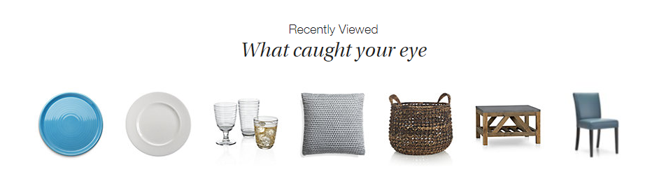
Ecommerce Merchandising Strategy Product Recommendations - Crate and Barrel Home Page Screenshot

Crate and Barrel promotes “Recently Viewed” items on every product page. This makes it super easy for a returning visitor to jump right back to what they were interested in, without having to browse around your site.

This product recommendation strategy also works great on major entry points into your site like the home page or in your shopping cart.

Another source of product data to use for “personalized” products recommendations is your customers’ wish list shopping cart history. These customers have already clearly indicated exactly what they want. So you should boldly give it to them.

Other uses of your visitors’ shopping history include:

  • Highlight a special promotion for wish list items
  • Recommend complementary products that go great with a recent purchase
  • Show a reminder for abandoned cart items
  • Add an easy “Order Again” button
  • Create custom product landing pages for shoppers who clicked your retargeting ads

All of these online merchandising strategies can help grow loyal, repeat buyers and encourage returning visitors to buy more.

But what if someone is a first time visitor? Fortunately, there is another segment of high-value shoppers that you can convert with powerful merchandising.

Win high-purchase intent shoppers

Certain customers come to your site ready to buy. The question is: Are they going to buy from you or go to your competitor?

Who are these high-purchase intent shoppers? They are the visitors that use your site search functionality. SLI studies have found that visitors that use search buy at a 2.7x greater rate than visitors who just browse.

Search users have indicated exactly what they want. They often include a specific product option like a color, size, or material in their query. So you need to quickly get them to the product page for the best selling match.

Don’t make these folks navigate their way to what they want. No extra clicks. You’ll likely lose them even if you have a great price and an amazing free shipping offer.

In fact, there is one merchandising technology that dramatically helps you convert these must-win buyers – autocomplete.
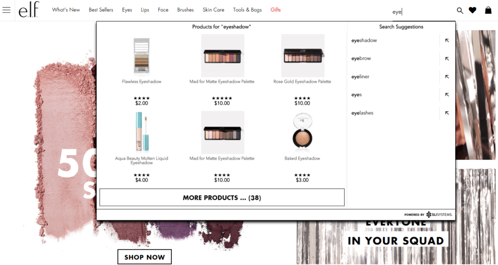
Visual Merchandising Autocomplete E-commerce Site Search - e.l.f. Screenshot

A great autocomplete example is e.l.f Cosmetics. They go beyond simply displaying matching text keywords as the searcher types. They display specific product results while adding visual merchandising with appealing product images.

You are more likely to convert these shoppers by showing a product, not a category. Again, less clicks and browsing is what you want.

That’s just the start. Lock in more sales from high-purchase intent shoppers with other tactics that use search data to improve merchandising.

Now let’s turn our attention to another customer segment, who likely make up the majority of your traffic.

Convert browsers into buyers

Some customers have an idea in mind but may not be ready to buy. In a brick-and-mortar retail analogy, these folks are the “No thanks. Just browsing” shoppers.

They may be “looky loos.” However, your merchandising can effectively nudge these visitors toward a purchase.

Classically online retailers attempt to attract these browsing shoppers by promoting categories or themed product groups like seasonal or clearance categories. However, this approach just keeps them clicking through your site and you hoping they stumble on something that sparks a sale.

And that’s one of the big reasons why many visitors leave an online store with an empty cart. The merchandising kept them in a browsing mindset, not a buying one.

Do not be afraid to promote specific products. Smart online merchandisers are now curating and promoting sets of individual products, not general categories, on their highest traffic pages.
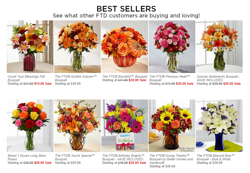
Product Recommendations Strategy - FTD Best Sellers Screenshot

FTD.com gives a big portion of their home page to promote their Best Seller products. What those product recommendations do is switch the shopper to an active “Oh. I need that too.” mindframe. And out of a passive “just looking” mode.

Tap into your massive SKU list to find the top sellers, new products arrivals, seasonal products, or specific sale items. Use your merchandising data analysis expertise.

Then continually test which products are getting the most clicks and conversions.

Simply promoting specific products can help increase the possibility of an impulse purchase, or more likely, can create a desire to come back to your site when they are ready to buy.

Now that you’re thinking from a customer perspective, let’s take your merchandising strategies to the next level. You can optimize the customer experience by where those visitors are on your site.

Merchandising Best Practices For E-commerce Websites

There is a flow to how people shop.

A brick-and-mortar retail store starts merchandising right up front as you walk in the door. Then throughout all the aisles, displays, and checkout counters. The whole store experience is intentionally designed to drive more sales.

An online customer experience also has its flow. Your e-commerce shopping journey can be designed to maximize sales too.

Every part on your site is a merchandising opportunity – the home page, navigation menus, category pages, product pages and your checkout pages.

Hundreds of online site search tips and navigation best practices have been published that can have a big impact on your sales.

Here are the top online merchandising tactics for your e-commerce website that are red hot right now.

Visual Merchandising on Product Pages

Let’s start where customers most often click “Add to Cart” – the product page.

Many elements of the product page help merchandisers showcase that that this is the right product at the right price – product title, descriptions, specs, purchase options, ratings, reviews, and, of course, pricing and discounts.

This information appeals to the rational part of your shopper’s brain.

The part that usually makes the ultimate buying decision is the emotional part of the human brain. That’s where online visual merchandising excels.
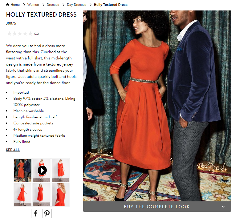
Ecommerce Visual Merchandising - Boden Product Page Screenshot

You also want to show off your products. Boden uses model videos, shows products from many angles, and switches custom images by color selection. These extra images give shoppers context when they can’t actually hold the item in their hands. You want them to easily envision what their experience will be after the purchase.

To help shoppers visualize, update product pictures instantly when they select different options like color and allow shoppers to zoom in to the smallest details.

Also, show action shots and product videos that depict how the product is used, what the buyer gets in the box, or how to install it.

Now augmented reality applications are being tested too. From arranging virtual furniture in a picture of your home to trying on different outfits in selfie mode on your smartphone, this next generation of visualization is an e-commerce merchandising innovation you will want to explore.

Personalized Product Recommendations

Product recommendations have long been a valuable online merchandising tool. You can tune your recommendations strategies using best practices for each different page on your site. Now recommendations technology is getting even smarter.

Smart product recommendations are personalized to the individual shopper in real-time. The products displayed adjust automatically based on user activity, preferences, and sales trends.
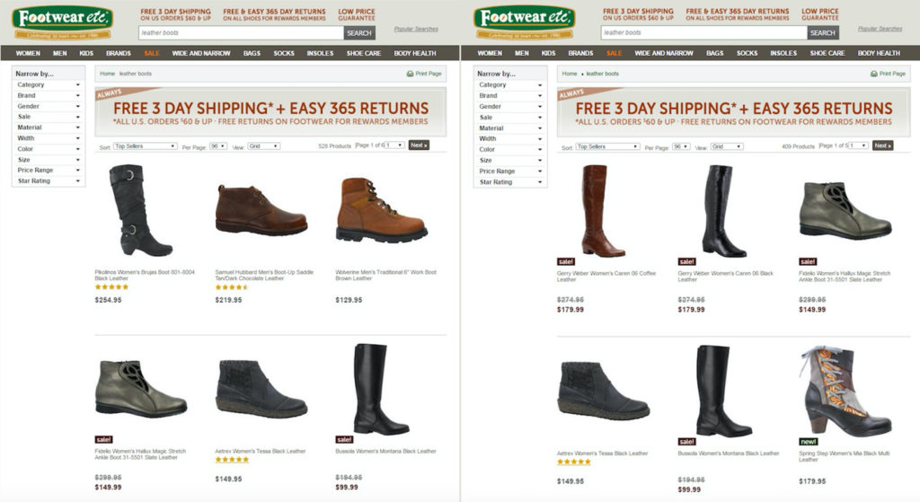
E-commerce Personalization - Footwear Etc Screenshot

Footwear etc. adds a level of personalization based on gender. Product recommendations, search results and category pages use the products or pages previously viewed by the shopper. If a shopper starts out browsing women’s sandals, then recommended product results would boost women’s shoes or accessories on subsequent pages. The screenshot above shows before and after results when a shopper searches for “leather boots”.

This type of contextual personalization can be tuned for many different facets, including gender, size, brand preference, or location.

Not only are these higher-converting recommendations displayed in real-time, but this personalization works for first-time visitors just as well as returning shoppers.

Complementary Sales in the Shopping Cart

You also want to extend those product recommendations to your shopping cart and checkout experience. Just like your grocery store places a rack of candy and magazines in the checkout line, online stores have a great opportunity to capture extra sales right at the point of purchase.

Only for online stores, this upsell merchandising strategy can be even more profitable.

Again, you can personalize the products you merchandise based on real-time data. You know what products they have added to their cart. You know the other products they have viewed.

And most importantly, you know what other products complement those items.
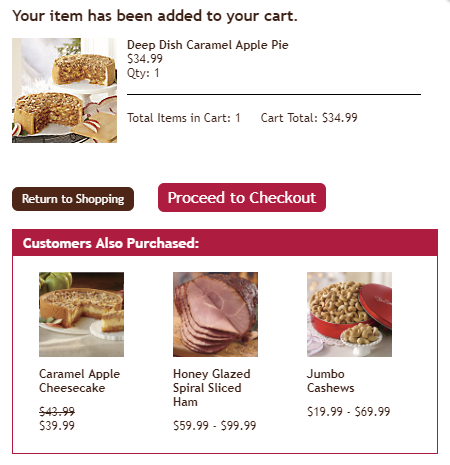
Online Merchandising Product Recommendations in Shopping Cart - Swiss Colony Screenshot

Swiss Colony promotes “Customers Also Purchased” at the beginning of their shopping cart experience.

Other popular recommendation strategies in the checkout experience are “You may also like” and “Complete the set.”

Just be careful to use complementary products. Do not necessarily use the exact same product recommendation logic as your product page. You don’t want to accidently promote an alternative to the product your customer has already decided to buy.

At best, that mistaken recommendation is ignored, meaning a wasted upsell opportunity. At worst, your customer stops and doesn’t complete their order because now they’re not sure if they’re buying what they really want.

So make sure that you are tuning the product recommendations in your shopping cart to complementary products that add to your sales, not disrupt them.

Now let’s use powerful data analytics and technology to deliver the best results without extra work.

Merchandise the Right Product to Win the Sale

You understand the customer. You know how to merchandise for each step of the online customer experience.

Now we can put it all together with great data and your product expertise to personalize the shopping experience… and get the sale.

Data Mining for E-commerce Merchandising

Your website analytics, your product systems, and your e-commerce platform transaction system combine to provide an astonishing array of data. That data can be mined and used to fuel your merchandising decisions.

You just need to look at what you have.

Data you know about your customer:

Your website analytics software offers useful demographic information about your customers and deep insights into what they are doing on your site.

Here are some of the most useful data types that can help your e-commerce merchandising strategy:

  • Traffic Channel: Where did your visitor come from?
  • History: Are they a first-time visitor or returning shopper?
  • Behavior: Where did they go on your site and what did they do there?
  • Gender: Are they female or male?
  • Age: How old are they?
  • Device: Are they on a mobile device, tablet or traditional computer?
  • Geography: Where in the world are they?

Now pair that up with what you know about transactions stored in your e-commerce platform.

E-commerce Platform Data:

Every past purchase provides information that helps you understand what customers are likely to buy in the future.

  • Product Sold: What product exactly is purchased?
  • Options: What sizes, colors, styles, and other product options are purchased?
  • Price: How much did it cost and what was the discount?
  • Order quantity: How many did customers buy per purchase?
  • Time/Date: When did the purchase occur?
  • Payment Method: How did they pay – credit card type, PayPal, on credit/layaway?
  • Shipping: How did the customer want this delivered?
  • Abandoned Carts: What products are selected but never actually purchased?

Best selling products should always be at the top of your merchandising list. But there is even more product data available to you. And that’s your merchandising experience.

Data from your experience:

Lastly, your own experience and intuition adds the special sauce to your merchandising data recipe.

  • Social trends:What’s hot right now with your customers?
  • Brand trends: What product brands can help pull in buyers?
  • Seasonality: What holiday or seasonality drives purchases?
  • Inventory: How much is in stock?

Compile all of this data, analyze it, and determine what products your customers are most likely to buy right now.

However, the challenge with the plethora of available data is… there’s so much data. It’s incredibly difficult and time consuming to effectively wrangle all the valuable data to merchandise to every single visitor on every single webpage for all your products.

That’s where new artificial intelligence technology helps.

Artificial Intelligence Fuels E-commerce Automation

Automating your data processing to power real-time merchandising decisions is quickly becoming a must-have for online retailers.

Fifty-four percent of e-commerce sites have already implemented or plan to add AI in the future, according research from the Q3 2017 E-commerce Performance Indicators and Confidence Report. And 20% expect to add AI within the next 12 months.

So what is the most popular applications for AI right now?

Not surprisingly, merchandising techniques are at the top. Personalized product recommendations is number one. Fifty-six percent of online retailers report that they are already using artificial intelligence in their product recommendations strategies (18%) or plan to implement within the next 12 months (38%).

Other merchandising solutions and visual merchandising technologies are also being accelerated thanks to AI. Virtual buying assistants, chatbots, visual search, augmented reality (AR), and virtual reality (VR) are all designed to help shoppers purchase the right product fast.
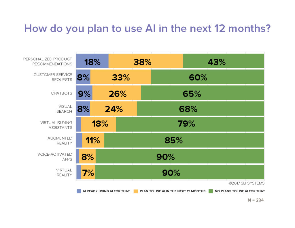
Ecommerce Artificial Intelligence Applications Research Chart - EPIC Report Q3 2017

More automation definitely helps maximize results in less time. And in new ways.

But is artificial intelligence going to take your merchandising job away? Absolutely not.

You won’t hand over the keys entirely to your automation systems. You need to maintain a mix of merchandising techniques and always be testing to get the maximum results.

Testing Your Merchandising Strategy Mix

“Always be testing” is more than just a matra. It’s a requirement to truly maximizing your conversion rates and your total online sales.

Most every online retailer tests performance of different on-page merchandising elements. That helps determine your optimal page design. For example, a simple A/B test of your search box location can pay off big by converting high purchase-intent shoppers.

Or determine how many products should be displayed in your product recommendations. Pro tip: SLI Systems’ merchandising best practices show that 4 or 5 products are ideal. And that scrolling carousel presentation of more products doesn’t generate significantly more incremental sales.

Another high-impact test determines the best rules for your site search and product recommendation results. Keyword matching algorithms alone likely do not give your shoppers the most relevant product results, which lowers your conversion rates.

Merchandising-savvy online retailers use a prioritized mix of multiple rules to drive the most sales. They combine artificial intelligence results with pre-defined tuning rules, product and category keyword matching, and sales leader products to generate the maximum online revenues.

More E-commerce Merchandising Tips

The key to your online merchandising success is to figure out what each visitor is most likely to buy.

It’s not easy. But you can drive many more sales leveraging a deep understanding of your customers, the latest technology, and the leading edge online merchandising strategies.

We’ve shared the newest merchandising techniques here. And you have many more proven strategies and tactics available to you. Make sure to grab the hundreds of site search best practices, e-commerce navigation tips, and watch what leading retail brands are doing in these online merchandising webinars.

Refining Your Site Navigation (Part 2)

Posted by Lauri LarjoJanuary 13, 2016Color, eCommerce, Merchandising, Navigation Tips, Refinements, SEO, User Experience

As we discussed last week, the purpose of refinements is to allow shoppers to find what they are looking for more quickly. By indicating specific characteristics to narrow down the number of options shown in a category, visitors don’t have to scroll through pages of products to find the right one.

There are some simple ways you can deliver an exceptional shopping experience through your refinements.

SLI Color PaletteConsider a Color Palette

Color palettes provide a visually appealing way to show color options for a particular product. Plus, it takes the guess work out of identifying colors with names like vermilion (a reddish orange) or verdigris (a yellowish green). Color palettes are often displayed on the left column with other refinements.

Show Products in the Right Color

Display products in the color shoppers requested. For example, if the default image for a shirt is red, but it is also offered in blue, show the blue shirt when shoppers refine the category to blue.

If your product is available in several colors, let visitors see the color options from the navigation page. One effective way of doing this is to allow visitors to hover over the color palettes directly under the picture of the product. The color of the product changes, while other products on the page remain unchanged.

Use Images

The human brain processes images faster than text. Consider using images to signal certain refinements, such as apparel type (dresses, shirts, pants), brands, ratings, colors and shapes. Of course, images won’t work for some refinements, so use your judgment. Make sure the images you use are clear and simple, so your customers won’t be left guessing.

SLI Navigational ImagesUse Easy-to-understand Navigational Images

If you use navigational images to identify subcategories, make sure they are easy to understand. You want to make sure shoppers don’t accidentally confuse the subcategory images for the product selection.

Provide the following visual cues:

  • Show products as well as subcategories
  • Include the number of results for each subcategory
  • Label the subcategory images clearly
  • Distinguish between the layout of your products and subcategories

Offer Multiple Ways to Unselect Refinements

Let visitors easily change and remove refinements. Customers may want to navigate to the top or up one or several levels within a category. Use a Show All link or a breadcrumb trail to enable a quick link back to a category page or higher navigation levels. Breadcrumb trails help visitors see
 exactly where they are on the site and what refinements have been used.

Another best practice is to use an X or checkmark beside the selected refinements. This allows visitors to easily remove a refinement selection without deleting all the selected refinements and gives shoppers the flexibility they need to find the item they’re looking for. A Clear All option offers a quick “back-to-the-top” navigation alternative.

For more tips on how to improve your site navigation, download our Big Book of Navigation Tips.

Refining Your Site Navigation (Part 1)

Posted by Lauri LarjoJanuary 6, 2016eCommerce, Merchandising, Navigation Tips, Refinements, SEO, User Experience

Refinements allow visitors to quickly narrow down their product selections as they travel through your site. This is one of the best ways (aside from using the search box) that visitors express to you exactly what they want.

The right use of refinements can make the shopping journey easy and intuitive. From broad category pages, you can break down choices into more specific subcategories. On a furniture site, for example, shoppers might start with the Living Room category then navigate to Sofa and Armchairs, Coffee and Side Tables or Living Room Lighting, depending on what they need.

In addition, providing refinements for brand, price, style and color can help shoppers pinpoint the products they had in mind. In my next two blog posts I will outline some practical ways refinements can help you improve your site navigation.

Don’t Show Too Many Refinements

Instead of showing every possible refinement (which can overwhelm shoppers), examine your analytics to see which refinements are used the most and which are hardly used at all. For example, do you really need the option to refine jeans by the number of pockets? If it is useful to your visitors, then show this option only when it’s relevant. A simple list of refinements versus a convoluted one increases your chances of improving your conversion rates.

Only Show Refinements with Results

Show relevant refinements for each category and make sure each refinement option contains results. You may be tempted to provide general refinements across your site for all category pages, but this can lead to a frustrating shopping experience. For example, you wouldn’t want to provide a refine-by-color option if an item is only available in one hue.

SurfStitch_SLIShow the Number of Products for Each Refinement

By indicating the number of products for each refinement, shoppers quickly understand how many results they can expect to find under each option. This guides them to consider other refinements if necessary and assures them they have seen all possible products.

Provide Different Ways of Ranking Products

Let visitors easily re-rank the criteria for how products are shown. Shoppers might want to view products by best sellers, highest rated, new arrivals, most expensive or least expensive. As a default, show products in order of most relevant or most popular. Once a visitor chooses a new order, remember the preference to spare him or her the hassle and frustration of re-ranking products on each category page.

For more tips on how to improve your site navigation, download our Big Book of Navigation Tips.

Announcing Next-generation Learning Navigation

Posted by Lauri LarjoSeptember 24, 2015eCommerce, Merchandising, Navigation, SEO, User Experience

learning_navIn the drive to turn your visitors into buyers, navigation is a critical part of the shopping journey. More than 70% of site visitors navigate their way to the products they have in mind. But if your navigation is clumsy or confusing, those shoppers are more likely to bounce than buy.

Site Navigation as a Tool for Merchandisers, Content Marketers and SEO Pros

Originally we launched SLI Learning Navigation® in 2006 to provide a consistent experience across a site that also uses SLI Learning Search®. Learning Navigation® has always leveraged our patented learning technology to continually re-rank products based on user activity. Over the years, our navigation solution evolved based on customer feedback.

Today we are excited to introduce the next generation of SLI Learning Navigation – completely rebuilt for improved SEO and better merchandising. The newest version of Learning Navigation is designed to give you more control over your SEO while creating a better user experience based on industry best practices.

Our revamped navigation solution dynamically generates clean, search engine-friendly URLs, making it easier for shoppers to find your products during an organic search. Our new interface allows you to quickly edit URLs, titles, headings, meta tags and page descriptions, giving merchandisers and content marketers more direct control over factors that affect their SEO.

Learning Navigation also helps you avoid SEO issues with duplicate content by controlling which pages search engines index. The navigation pages provide refinement and filtering options for the whole product catalog.

Learning NavigationBring Your E-commerce to the Next Level

Adapting to the evolving e-commerce experience and expectations of our customers is at the core of SLI – to continuously enhance our offering, accelerate your sales and provide these improvements seamlessly via our SaaS platform. We are excited to help you bring your e-commerce to the next level with this newest version of Learning Navigation.

For new customers, we recommend signing up for Learning Search together with Learning Navigation to gain the maximum benefits of SLI learning technology. For existing SLI Learning Navigation customers, our SaaS platform allows us to easily upgrade your Navigation for no cost at your discretion.

To learn more about Learning Navigation, click here.

B2B, It’s Time to Step Up Your Game

Posted by Christina StublerMay 11, 2015eCommerce, Site Search Tips, User Experience

b2b_blue_600x600 You found your niche in the lucrative (albeit lackluster) world of B2B e-commerce. It’s been great. Your clients don’t need anything fancy, you say. You can hum along with a website that walked right out of 2008 and it doesn’t matter. Because really, your customers aren’t here to shop (not in the traditional, show-me-something-pretty way). They just want to buy what they need and get back to work.

But here’s the thing: If you aren’t making it lightning fast and super simple for your customers to find and buy what they want, somebody else will. Somebody named Amazon. As Amazon launches “Amazon Business,” B2B sites would be wise to step up their game. Here’s how to get started:

  1. Start with search. Compared to non-searchers, searchers have an 11% higher average order value and a 2.7 times greater conversion rate, so it’s important and revenue-boosting to listen to what they say. Site search is key. If people quickly move from search to navigation or leave your site altogether, your site search isn’t doing its job. Good site search delivers relevant results fast.


  1. Showcase your expertise. You’ve created a virtual library of case studies, blogs, consumer guides and videos – all with the hope of educating and converting your prospects into customers. But can they find any of it? Andersen Windows is a good example of how to deliver search results with a wow factor. Type “French doors” in the search box, and you’ll get products along with support information, technical documents, photos and videos. Using SLI Learning SearchTM, Andersen Windows makes all of its non-product information incredibly easy to find.


  1. Be open to possibilities. At Spectrum Chemical, the search box invites users to input “Product Name, Catalog Number, Manufacturer, CAS #” – a confidence-boosting move that makes users feel they can’t go wrong. Smart search will allow you to create appropriate synonyms and tune your results so that visitors find what they are looking for, even if they type it in slightly different ways. Technical specifications and measurements are a great example. For instance, if someone typed 2.5, 2 ½ or 2-1/2, you’d want them to get the right results. In addition, features like SLI Rich Auto CompleteTM help people know they are on the right track by showing results as soon as they begin typing.


Remember, your search box is where your customers tell you exactly what they want in their own words. Advanced site search will give you the ability to easily pull reports and spot trends, like your site’s top search phrases and those ending in “no results.” Use this data to tailor your merchandising efforts and make it easier for visitors to find what they want to buy. Because being B2B is no longer an excuse for not delivering the very best to your customers.

Do Your Search Results Pages Drive Customers to Buy or Bounce?

Posted by Kemberly GongMarch 13, 2014Site Search, Site Search Tips

Search results pages are usually the place where online shoppers convert or leave. If your search really works and shows visitors the products they’re looking for, you’ll strengthen loyalty from those shoppers – or, if your search delivers a jumble of results that have nothing to do with the search terms used, it’s likely that shoppers will make a quick exit.

Search results pages need a little TLC so they can do the best possible job of showing off as many relevant products as possible, while allowing customers to adjust their view of results according to how they want to browse and shop. Here are a few tips to make sure your search results pages lead shoppers to buy, rather than bounce.

Create a consistent look and feel: Search results pages should not look dramatically different from the rest of your online storefront. It’s important to reinforce your brand in every element of your site, especially on the pages where visitors are making a purchase decision. Your results pages should mirror the look and feel of your overall website, brick-and-mortar stores and social channels. When all of these elements are properly coordinated, they create a positive brand experience.

Keep the search term in the search box: It is good practice to leave search terms in the search box, even when visitors are already viewing results. They may realize that they should add more descriptive words to their search terms or correct spelling errors. Some might want a reminder of what they just searched for. Whatever the reason, it’s helpful and saves time if visitors don’t have to retype their search terms.

Show a breadcrumb trail: A breadcrumb trail displays the search term and any refinements that the visitor applied to search results. It helps visitors understand where they are and how they arrived at the current page. It also makes it easy to remove search refinements and go back to a wider range of results. Breadcrumbs take up very little space on the webpage, but they can go a long way toward helping visitors navigate through search results.

There’s much more you can do to make search pages easy for visitors to browse, including allowing visitors to select the number of results they want to see on a page, or adding infinite scrolling so that visitors never have to click on a new page to see more results. For these tips and over a hundred more, download a free copy of the 2014 edition of the Big Book of Site Search Tips.

Is your Site Mobile & Tablet Ready for the Holidays?

Posted by Jeff HoltNovember 8, 2013eCommerce, Mobile/Tablets, User Experience

With the holiday shopping season upon us, eTailers everywhere are spending time to make sure site visitors have the best experience possible when browsing their sites. Positive shopping experiences result in more conversions, higher AOV (average order values) and return customers. With much of the focus still placed on desktop sites, many online retailers are missing the opportunity to concentrate on tablet and mobile optimized web sites – especially when more than 55% of all U.S. consumers have a smartphone and at least 35% own a tablet, according to Pew Research. As shopping on these devices increases in popularity, eTailers should consider investing more time and effort to improve their site usability, search and navigation to accommodate this shift.

Sales are Soaring

According to eMarketer, retail sales are expected to increase 68 percent from 2013 – 2017, with mobile commerce sales increasing a whopping 125 percent. Combine both smartphone and tablet, and mCommerce sales are expected to rise 38 percent next year. Looking at these numbers, it’s clear that mobile and tablet sites should be regularly looked at and updated along with the desktop version of your site.

Spontaneity leads to more than 80 percent of mobile purchases, and according to Brad Frost, mobile users will do anything and everything desktop users will do, considering ease of use and convenience. More than a quarter of all mobile users will abandon a transaction if a site is not optimized for mobile, with users believing that mobile transactions should be easier than online or in store transactions. Frost also reports that time spent on a mobile device is expected to overtake time spent on desktop this year, and Internet Retailer agrees that mobile devices now surpass desktops in eCommerce.

Tablets are Making Their Presence Known

Here’s some more interesting data from a recent study by Adobe:  tablet users are three times more likely to make a purchase over mobile phone users. They also spend 50 percent more than PC/MAC users, which makes this group worth targeting. Initially, smartphones had the lead over tablets in eCommerce sales, but tablets are estimated to account for more sales this year and will continue to rise at a rapid rate.

Make it Easy for your Customers

Mobile sites should be optimized in a way that puts what the user is looking for right in their hands as quickly and painlessly as possible. Mobile site design should not be too busy or crowded; the layout should be simple and products should be merchandised in a way so that they are quick and easy to find.  Similarly, checkout should be secure and require minimal effort as users do not want to spend time filling out information on such small screens. Overall, mobile should cater to your target audience. For examples and best practices, see our previous blog post on giving your mobile shoppers what they want.

Tablet approach should be different than mobile. Tablet users are known to spend more time on sites interacting and engaging with content and media. In addition to design and layout changes, online retailers should consider including product videos and any other features that users can interact with, as studies show that tablet users will spend more time playing with these features before making a purchase.

eTailers have just a small window of opportunity to compel the user to make a purchase. Because of this, site search becomes even more important.  Your site search bar should always be prominently displayed (no matter which interface the user is viewing your site from) and should contain an auto-complete feature for faster searching.

Once your site is all set up, consider letting your users do the merchandising for you with SLI’s patented advanced search technology, Learning Search for Mobile. Learning Search watches your website’s user behavior, and automatically re-ranks your products based on user click-through rates. The faster a user can find what they are looking for, the more likely they’ll be checking out with gifts for loved ones this holiday season.

Jeff Holt is a Customer Success Manager for SLI Systems. For further product insight contact him at jeff.holt@sli-systems.com.


What Do Young Consumers Want from eCommerce?

Posted by Erika StasiSeptember 23, 2013eCommerce, Navigation, Navigation Tips, Site Search, Site Search Tips, Social Media, User Experience

In my last blog regarding usability, I detailed some of the design features and functionality that make eCommerce user-friendly for an older demographic. The important features to optimize site search and navigation for the 65 and older user contrasts considerably with today’s youngest set of shoppers. These digital natives, ages 12-17 years old, are comfortable with evolving technologies, new features, and shopping concepts that take shopping online to a whole new level.

Investment firm Piper Jaffray, in its 25th semi-annual study, found that 79 percent of teen females and 76 percent of males shopped online, with 70 percent of those teens shopping online at their favorite stores. Creating an engaging and valuable website is crucial in capturing the attention of young shoppers, who have never experienced a time in their lives without technology.

Important Features for the Young Online Shopper

Jakob Nielsen, a pioneer in the user experience field, has researched the usability features most important for the teen online shopper in his article, “Teenage Usability: Designing Teen-Targeted Websites.” Nielsen says sites geared toward the teen market should use less text and adhere to standard design layouts. Examples of such sites are HotTopic.com, KidRobot.com, and SpencersOnline.com. Nielsen points out some specific design features that are important for teens: use of bright color, high quality images, integrated media such as videos and music, interactive games, and links to social media.

The Influence of Social Media

Social media has become an integral part of the teen market online shopping experience. The 2013 Piper Jaffray survey confirms that Facebook and YouTube are still the favorite social media sites for teens, with 53 percent of females and 52 of males indicating that social media influences their purchases (especially Facebook).

Other non-conventional social media platforms such as Pinterest and Polyvore have created innovative ways for teenagers to connect with their friends, see what their friends are interested in, and link them directly to eCommerce sites where purchases can be made.

Polyvore, for instance, is a community-driven social commerce site where members pick and choose from a variety of clothing, shoes and accessories to create fashion collages. Users can see other community members’ and friends’ fashion boards. Below these completed fashion boards are links to external retail websites, where users can complete any online transactions.

Pinterest, like Polyvore, is community-powered and allows members to follow friends’ and like-minded individuals’ pinboards. Pinterest users can re-pin rich images of home design, nature, fashion, food and beverages, and an assortment of other items for their followers to see. Each image or “pin” links directly to an online retailer’s site, essentially sharing that link with a huge network of followers.

Surprising Findings on Usability for Teens

Compared to other demographics, the teen market is actually less affected by poor usability features such as errors (their own or at the fault of the site). In the case of negative usability, such as slower loading time, the teen market has been shown to forgive and forget more easily than the senior market. Longer load times can still be frustrating for any user demographic, and may seem even more so for a group that craves instant gratification. However, patience is something that the youth market has practiced because of all types of technology mishaps they experience on a daily basis. This is unlike the senior market, which isn’t completely absorbed by the tech craze of smartphones, tablets and laptops.

Why the Teen Market Matters

Although some will argue that tailoring eCommerce sites to attract the teen market isn’t as valuable because teens don’t have direct buying power when it comes to online shopping, they are extremely influential when it comes to the consumption levels of their parents. According to the 2012 Harris Poll YouthPulse, teen-influenced purchases account for over $211 billion worth of purchasing power! With 23 million teens in the U.S. alone, teens are making a huge impact to the economy and their parents’ wallets.

When considering the teen demographic in their site design and usability, internet retailers should implement those site search tips listed above as a starting point to capture their target market.  Including non-product content such as social media links and interactive content such as Instagram, Pinterest, and Polyvore is a way to stay relevant and exciting to this young group. The key to engaging these Gen Z consumers is to keep it simple, avoid boring content, and consider using responsive website designs for multiple interfaces to keep your site fresh and fun.

Contact SLI Systems for a free site critique to learn how you can optimize your eCommerce site for this emerging youth market and other key market segments.

Usability Features for the 65+ Online Shopper

Posted by Erika StasiAugust 12, 2013eCommerce, Site Search, Site Search Tips1 comment

Many of us know someone over 65 who is hesitant to shop online, or even use a computer or smartphone. This leads to the common perception that users 65 and over are resistant to adapt to changing technology. However, some studies show that more than half of the senior market has integrated itself in the eCommerce experience and is continually embracing this “new” way to shop.

As of 2012, 19 million American seniors are avid Internet users, and this number has been growing 16 percent per year for the last decade. According to a recent Pew Research Center study, that’s more than half of the senior population, approximately 55 percent!

As shopping online becomes as routine and easy as checking one’s email, it’s no wonder why the majority of the senior market has really embraced this shift toward online browsing and purchasing. And for some seniors with limited mobility or fixed incomes – or those just looking for a convenient way to quickly browse a number of stores – the benefits of online shopping are becoming even more apparent. The conveniences of shopping at home, combined with the opportunity to compare prices online, are driving this market to push the boundaries of their normal shopping habits.

Online retailers have recognized this shift toward online shopping for the over 65 demographic, and are making a stronger effort to cater to this market that was initially slower to adopt. Sites such as Hoveround.com, Jaystrongwater.com and AARP demonstrate the implementation of certain necessary and important design features for seniors.

Jakob Nielsen, in his article “Seniors as Web Users” observed that companies who redesign their website to give seniors a similar user experience quality as younger users can obtain 35% more business from them. Site usability is the most important aspect of any retailer’s site, as recognized by Nielsen in his research. According to the study, there are five main components that lead to successful site usability:

  1. Learnability: How easy it is for users to complete basic tasks on a first-time site visit.
  2. Efficiency: How quickly users can perform tasks on the site such as searching, ordering and checkout.
  3. Memorability: How quickly users can re-establish proficiency with search and navigation after a period of not using the site.
  4. Errors: How many errors users make, how severe those errors are and if the user can recover from these errors (such as content errors, spelling mistakes and the like).
  5. Satisfaction: What users get out of the site design aesthetically, which is imperative for effective site usability.
    .

For the senior market, the most important usability features are the ease of accomplishing basic tasks on a first time encounter, how much they remember about the site’s design after not accessing the site for a long period of time and whether they can recover after making search errors.  Users aged 65 and older are 43% slower at using websites than users aged 21–55. And when they had site search problems, seniors blamed themselves 90% of the time, compared to 58% of younger users. This is where a carefully planned user interface and site design is paramount in successfully capturing the senior market to shop on their sites and increase loyalty and retention among eCustomers.

Some design features necessary in developing senior-friendly websites include a large, distinct search bar, clear and bold navigation buttons, easily-readable text and prominence of the most important information above the fold. Other very helpful features are a Frequently Asked Questions (FAQ) page and multiple areas for contact information.

Research by MarketingSherpa suggests that visitors spend about 8 seconds before deciding whether to remain on a site or to search elsewhere. Having a clearly marked search box that returns highly-relevant results is a key component in lowering abandonment rates and increasing conversions to any age demographic – but even more so with this particular market. Online retailers who want to keep seniors coming back to their sites should consider working with search and navigation experts that can help them implement these key design features and ensure than search results are always relevant.

Looking toward the future, we can expect that the 65 and over market will be savvier when it comes to online shopping. Eventually, shopping online will be the norm and the senior market will have completely immersed itself into the experience.

Contact SLI Systems for a free site critique to learn how you can optimize your eCommerce site for 65+ buyers and other key market segments.


Stay up to date with SLI

Featured Posts

  • Maximize Revenue with Enhanced Product Impact Testing
  • Top Five Ways to Prepare for Peak Season
  • Facets, Facets, Who’s Got the Facets?
  • Personalization: It’s Kind of a Big Deal
  • M is the New E: Mobile Commerce Trends and Predictions

Categories

About SLI Systems

  • What We Do
  • Who We Are
  • Why SLI

Learn

  • Webinars
  • News Room
  • Events

Connect

© Copyright SLI Systems, 2018. All Rights Reserved | US: (866) 240-2812 | Legal